Design webapp contra old school webaccess => missing room
-
Hi,
Webapp has advantages over webaccess and webaccess ist dead.Is it possible to use the empty space in Webapp and build smaller icons?
- Webaccess

- Webapp

-
you can still use webaccess unofficially. It isn’t supported anymore and it won’t ever get improvements, but it still works and I still run it.
-
We are still using webaccess but also webapp
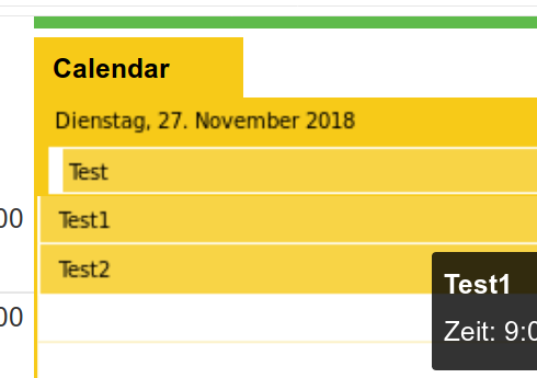
Webapp has a few disadvantages, see picture below. I have wondered why there ist this bad contrast in “dates” in the calender, wishy-washy fonts.
That’s why these are images and not text, or am i wrong? That didn’t scale right. Why is it realized like that?
In webaccess this is real text, better readable in smaller fonts and that should count.Word “Calendar” below is real text, Test, Test1, Test2 are images.
