icon design kopano webapp
-
Hi,
I’m the designer from breeze icons (default icon set for KDE and LibreOffice) and I’d like to finish you awesome design work already done with kopano.
As I use kopano webapp in the office I know kopano well so it’s easy to make icons for.
What I want to know is are there guidelines for the icons or the kopano design that I can use. I don’t want to offer you breeze-icons. It look only like kopano start with a new branding after the change from zarafa and some part’s aren’t finished. So I’d like to finish the work.
-
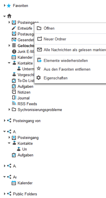
Here is my webapp installation. I looked also in the source code and it should look the same in master.

I’m thinking about the sidebar icons in general as you can see in the tabs if you write a new mail the icon is monochrome, write a new meeting, add a contact, note they are monochrome and new todo is again monochrome. Sidebar is also colored but look with the dark gradient not that modern as the overall kopano UX.
I’m thinking about two options. Make everything monochrome (look a bit boring and not that easy to understood) or give each section (mail, calender, contact, todo) a specific color and make colored icons with this specific color.
In general I’m for colored icons in the sidebar and for the “app” icons and monochrome icons (as it is in general now) for the action toolbar icons.
About colors I have the following suggestions
-
Hi @andreas_k,
This is great to hear! I will send you a private message so we can get in contact.
-Bob
-
First draft
Sidebar:

Top Toolbar:

Write Mail:

Meeting:

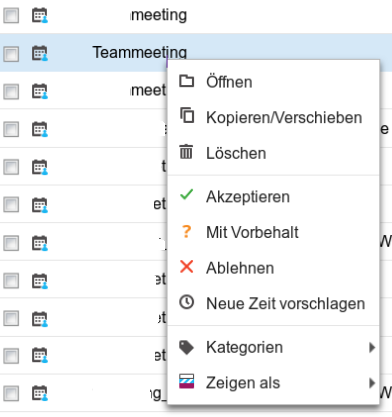
Right Click Mail:

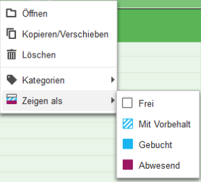
Right Click Meeting:

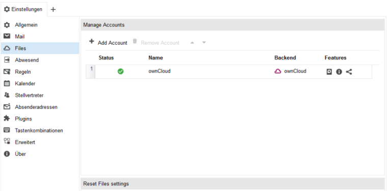
Settings:

Sorry but our installation is in german.
-
As the icon theme work well and Ronald Toussaint make an extension you can test the icon theme easy.
https://files.arsenalrace.at/owncloud/index.php/s/xJRPDpDCdrBH4vL
extract the tar file in the plugins folder of the Webapp and activate the plugin in your webapp settings dialogue -
-
This post is deleted!